Data Visualisation
Infographics, dashboards and visualising data.
 Video
Excel Video – Hiding Decimals, Using Colour, and Sorting to Make Numbers More Visual
In this short video, Ray Poynter shows how to hide decimal places in Excel, sort data, and sort…
16 October 2018
Video
Excel Video – Hiding Decimals, Using Colour, and Sorting to Make Numbers More Visual
In this short video, Ray Poynter shows how to hide decimal places in Excel, sort data, and sort…
16 October 2018
 Video & Slides
How to Make Numbers more Visual
Ray Poynter shares how to make numbers more visual through using simple techniques such as hiding decimal places,…
16 October 2018
Video & Slides
How to Make Numbers more Visual
Ray Poynter shares how to make numbers more visual through using simple techniques such as hiding decimal places,…
16 October 2018
 Event
‘How to …’ Webinars & Videos
This is an ongoing collection of ‘How to …’ webinars and videos. The Webinars and Videos be accessed…
1 January 2018 – 31 December 2018
Event
‘How to …’ Webinars & Videos
This is an ongoing collection of ‘How to …’ webinars and videos. The Webinars and Videos be accessed…
1 January 2018 – 31 December 2018
 Blog
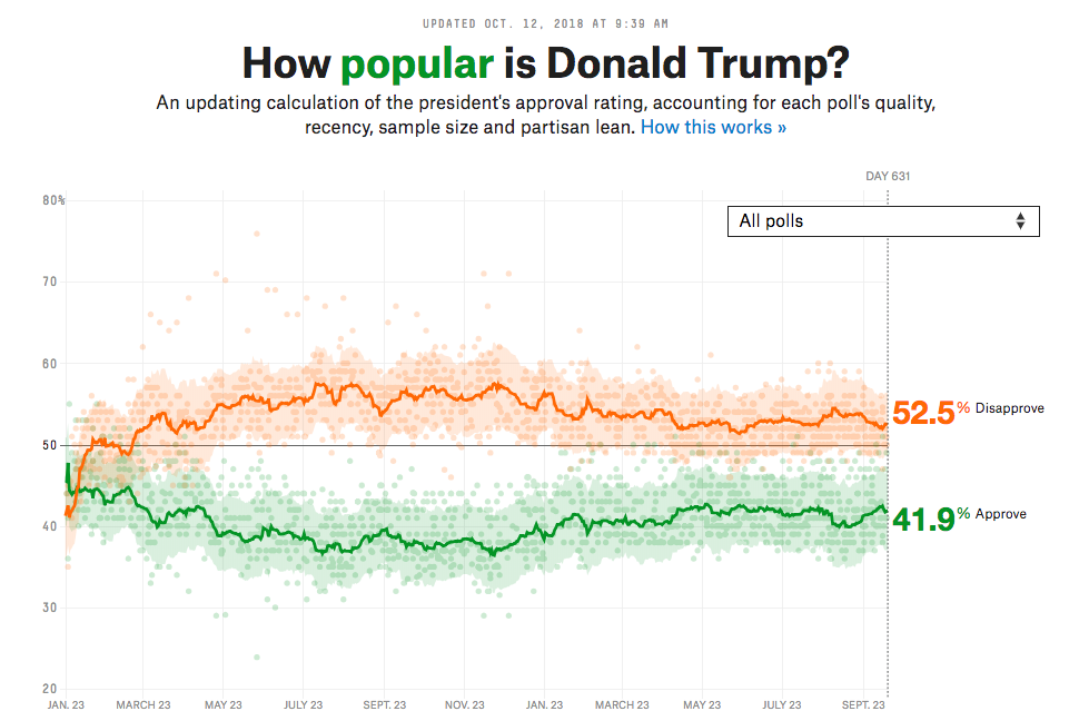
How to Use Comparisons to Understand Data
Posted by Ray Poynter, 15 October 2018. Most individual numbers do not mean very much. In many cases,…
15 October 2018
Event
How to make numbers more visual
Webinar: 16 October, 2018 – 10am New York (3pm London) Click here to access the recording of this webinar,…
16 October 2018
Blog
How to Use Comparisons to Understand Data
Posted by Ray Poynter, 15 October 2018. Most individual numbers do not mean very much. In many cases,…
15 October 2018
Event
How to make numbers more visual
Webinar: 16 October, 2018 – 10am New York (3pm London) Click here to access the recording of this webinar,…
16 October 2018
 Event
The Future of Storytelling and Visualisation
This three-webinar event looks at how organisations are utilising storytelling and visualisation in market research & insights. Session 1, 4pm…
14 November 2018
Event
The Future of Storytelling and Visualisation
This three-webinar event looks at how organisations are utilising storytelling and visualisation in market research & insights. Session 1, 4pm…
14 November 2018
 Blog
Do you understand what sort of Data Visualisation you need?
Posted by Ray Poynter 27 April 2018 Over the past ten years, there has been a rapid and…
27 April 2018
Blog
Do you understand what sort of Data Visualisation you need?
Posted by Ray Poynter 27 April 2018 Over the past ten years, there has been a rapid and…
27 April 2018
 Video & Slides
Data Caricatures: rethinking visualisation for the modern researcher
For the modern researcher, process and language simplicity are crucial when it comes to visualising information. From working…
8 February 2018
Video & Slides
Data Caricatures: rethinking visualisation for the modern researcher
For the modern researcher, process and language simplicity are crucial when it comes to visualising information. From working…
8 February 2018
 Event
Americas Wednesday
Return to the Main Festival Page. Chair: Andrew Jeavons Katrina Noelle & Janet Standen Scoot Insights Rev Up…
7 February 2018
Event
Americas Wednesday
Return to the Main Festival Page. Chair: Andrew Jeavons Katrina Noelle & Janet Standen Scoot Insights Rev Up…
7 February 2018
 Blog
104 Facts You Don’t Know About Mobile Marketing
Guest blog by Megan Arevalo, WebsiteBuilder.org As well as the post below, Megan has contributed a really useful…
2 August 2017
Blog
104 Facts You Don’t Know About Mobile Marketing
Guest blog by Megan Arevalo, WebsiteBuilder.org As well as the post below, Megan has contributed a really useful…
2 August 2017
 Video & Slides
How to communicate numerical information
Following the success of the six-part series ‘Finding and Communicating the Story’ in 2016, NewMR have launched Part…
5 July 2017
Video & Slides
How to communicate numerical information
Following the success of the six-part series ‘Finding and Communicating the Story’ in 2016, NewMR have launched Part…
5 July 2017
 Blog
Why Use Bullets in a Presentation? The difference between good bullets and bad bullets.
Every so often there is an upsurge in criticism about the use of bullets in presentations, often linked…
8 June 2017
Blog
Why Use Bullets in a Presentation? The difference between good bullets and bad bullets.
Every so often there is an upsurge in criticism about the use of bullets in presentations, often linked…
8 June 2017